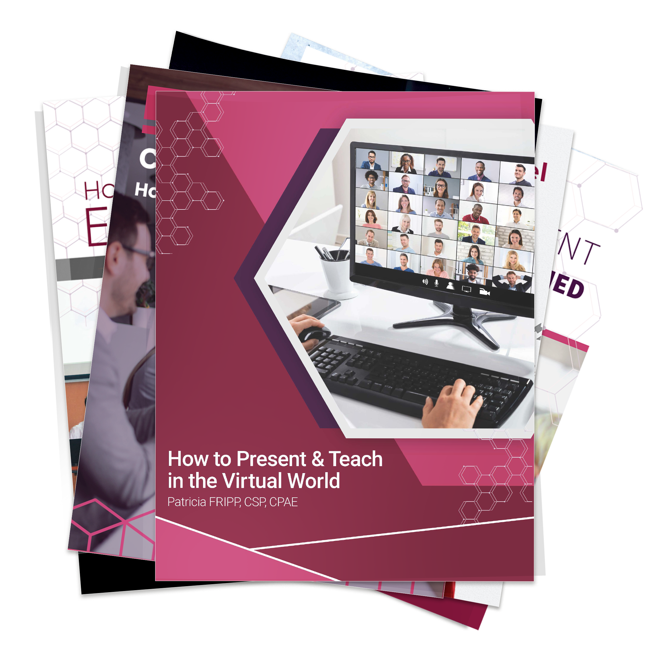
When I ask my clients, “How long is your presentation?” it scares me when they answer, “Twelve slides.” Even worse is when I ask, “How do you design your presentation?” and they respond, “We get the slide deck.”
Let’s be clear: PowerPoint is a very valuable tool, not a presentation. If you start with your slides, you’re putting the cart before the horse and sabotaging what could be a compelling and successful message.
Design First. Slides Later.
Presentation design is a creative, strategic process. Begin with your outline. What is your key message? What action do you want your audience to take? What stories will make your ideas come alive? Complete this on a flip chart, whiteboard, or legal pad.
Once your content is organized and structured, then—and only then—ask yourself:
“How can I visually support what I’m saying?”
That’s when PowerPoint becomes powerful. Charts, graphs, images, and diagrams help illustrate and amplify your ideas. However, only if used with intention.
Here are seven techniques to ensure PowerPoint works for you, not against you.
- Use Fewer Words, More Slides
Your audience can’t read and listen simultaneously. Don’t crowd each slide. Instead, spread your ideas across more slides and use fewer words on each one. Use builds (animation or transition effects) to bring in bullet points one at a time. Microsoft recommends using minimal and straightforward text per slide to keep the focus on your message.
Microsoft Tip: Aim for the “6×6 rule” – no more than six words per line and six lines per slide. I believe even that can be too much.
- Manage Attention: Blank the Screen
If you don’t want your audience to look at the screen, give them permission not to. When you’re telling a story, answering a question, or discussing something unrelated to the slide, turn the screen black. Press “B” on your keyboard or use your remote control. That small technique can bring eyes—and attention—back to you.
- Customize for Your Audience
Make your prospects feel special. Include their logo. Refer to their situation. Tailor your examples to their industry. If your slides look like you could have delivered them yesterday to someone else, you’ve missed the mark. Customized images build connection and credibility.
For example, when I was delivering a virtual presentation for SHRM in Mexico, I removed every image of people and replaced them with pictures of people from Mexico. A week later, I presented to SHRM in Barbados. Yes, you guessed it. These images were replaced with people who live in Barbados. The content was the same as I would deliver in the US.
Microsoft Suggestion: Use “Design Ideas” in PowerPoint to quickly adapt a consistent look and feel, then customize with your client’s branding.
- Remember: Slides Don’t Build Relationships
Ask yourself: “If I emailed my slides, would I make the sale?” Of course not. You are the most essential part of the presentation. Your slides support you, not the other way around.
If you could still make the sale without slides, you’re truly presentation-ready.
- Prepare Two Versions

If your message is complex, create two versions of your PowerPoint:
- One for delivery: image-rich, text-light, visually engaging.
- One as a leave-behind: detailed, complete, and readable without narration.
Not all of what you say needs to be on the slide. What’s on the slide does not need to include everything you say.
Microsoft Tool: Use “Speaker Notes” for your delivery version. Then, create a “Save as PDF” version to use as your handout.
- Be Visually Consistent
In many organizations, slides come from multiple decks. This leads to inconsistent fonts, colors, and formatting. This distracts from your message. Choose a style and stick with it. Same font. Same alignment. Same rules for capitalization and punctuation.
Microsoft Tip: Use Slide Master to enforce consistent branding and formatting across all slides.
- Be Ready to Unplug
Not every decision-maker wants PowerPoint. Some want a whiteboard discussion. Others prefer just a conversation. Be prepared to unplug and adapt. If a client says, “Please, no slides. Just talk to us,” be ready to deliver with confidence, clarity, and structure.
This flexibility proves your command of the material and deepens trust.
Bonus: Design with Accessibility in Mind
Microsoft emphasizes accessibility. When creating slides:
- Use high contrast text and background colors
- Add alternative text (alt text) for images
- Use built-in slide layouts rather than text boxes

- Avoid flashing or fast animation
These minor adjustments ensure everyone in your audience can access and engage with your content.
FrippVT: Your Solution for Powerful, Persuasive Presentations
FrippVT is my web-based training platform that gives you the skills to become a world-class presenter—on your schedule. Whether you are a novice or seasoned speaker, you’ll find ideas you can use immediately.
If you want to transform your presentations and become the confident communicator your role demands, FrippVT is your next step.
Complimentary trial available now: FrippVT.com
“The information in FrippVT is as valuable as any college course I’ve taken. This is a resource that everyone should be aware of. The investment is worth ten times more than I paid and has been life-changing. My fees, recommendations, and referrals have increased dramatically. I am delighted.” Mitzi Perdue, author of How to Make Your Family Business Last
“To watch how our veteran group of salespeople became involved in your Storytelling to Increase Sales was impressive. We are excited to continue your training with FrippVT Sales.” Jeff Walters, Vice President, North American Sales, Peak-Ryzex
“For my most important speeches, I call Patricia Fripp.” Wanda Hope, Chief Diversity Officer, Johnson & Johnson Worldwide
Need help for you or your team on improving important conversations and presentations? The Fripp Customized Approach will work for you. Contact Fripp today!